Reska Donaga
Overview
Reska Donaga a Product Manager at one of the biggest start up company (e-commerce) in Indonesia. As he live a professional life, one of his passion is writing.
He wants to redesign the new blog website to fit his new design style and needs.
After discussions and discovery about his taste and preference in design, he wanted a simple clean looks. His old website is using WordPress' default blog template. This project finish within 1.5 month.
Problems
In his busy days as professional, he always had a hard and long time to finish an article. One of the reason is featured image that comes with the stories. If he let it empty, the post in blog homepage will show blogpost without image and he hate that.
Goals
So the blog design should fit his needs, which is blog post (list or single post template) must still looks beautiful even without featured image.
Process
Custom Fields
In Reska's case, his writing ideas and inspiration should not wait for the right picture, instead should be written when he had the chance in his busy life.
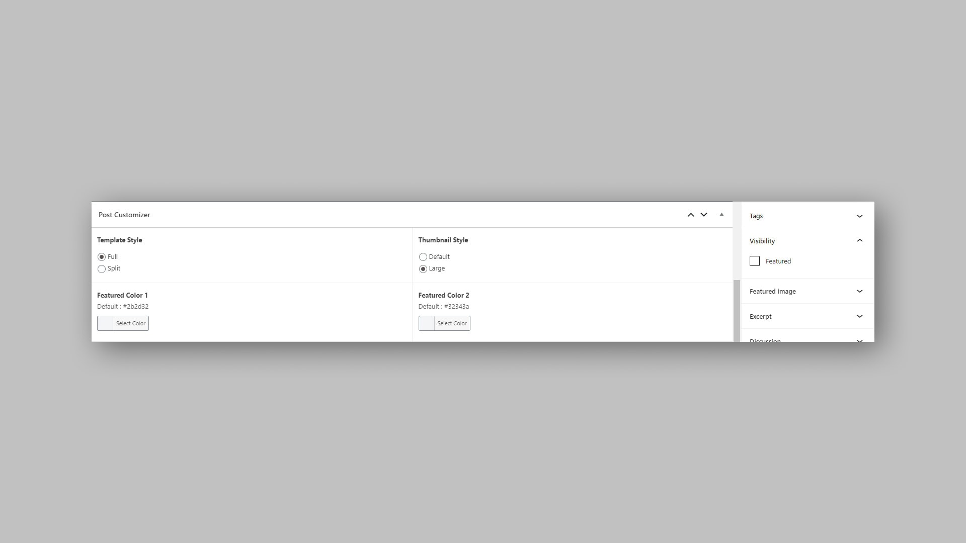
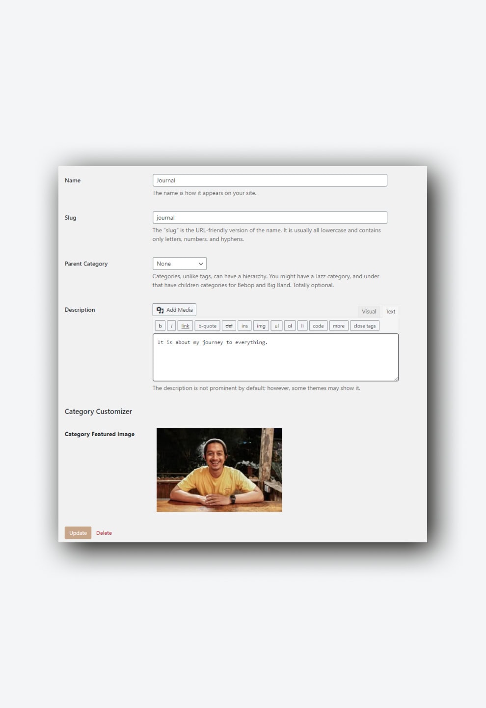
Rather than just use featured image, and hate to showcase blank image in post list or homepage, and take a long time and had to choose a picture for the post, why not use color too? That way, the post can be written without finding the right picture.
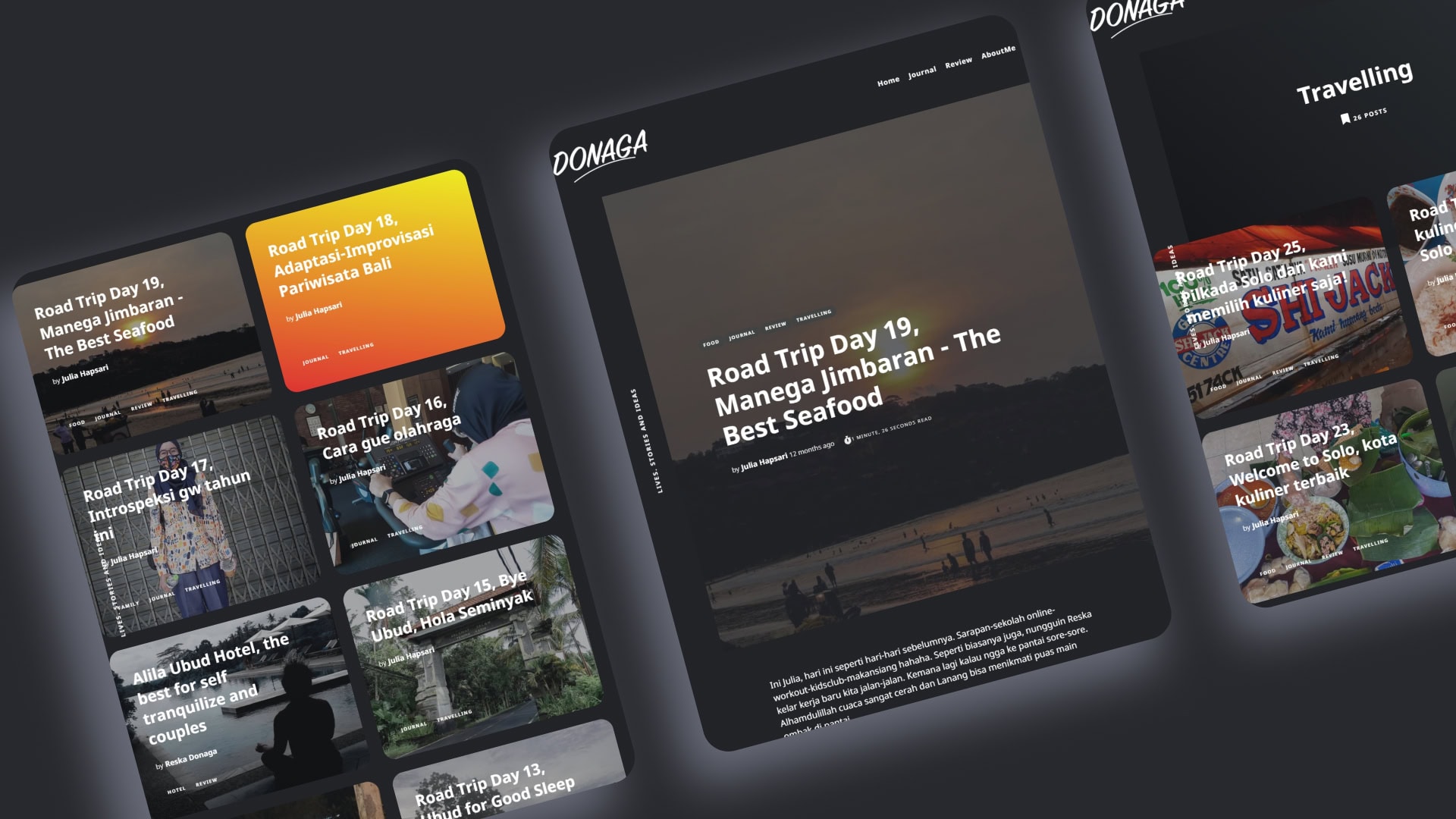
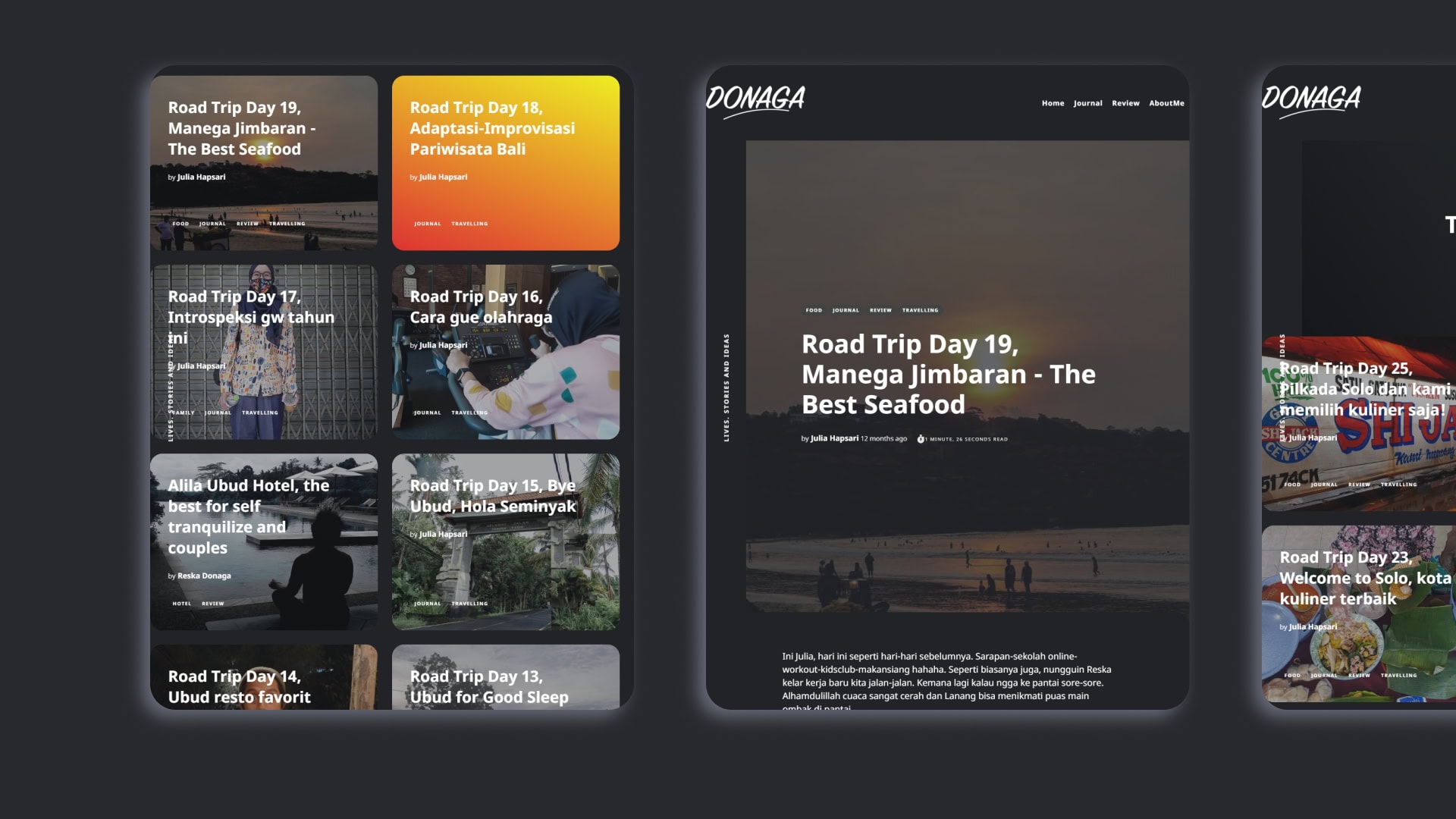
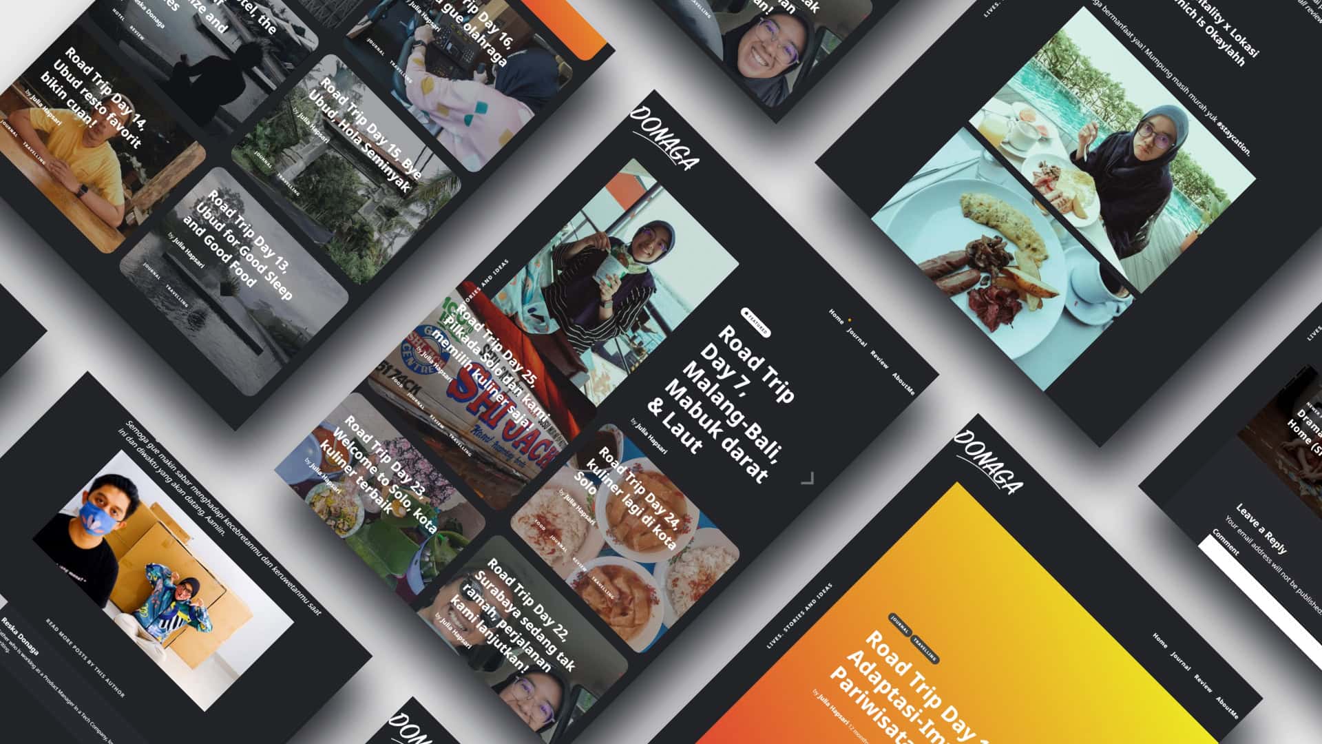
I designed the post list as a grid that has a box background that filled with color and/or featured image behind the title and article description. A custom field provided to let him choose color, with default color in place, when no featured image added, the post has color background, if both featured image or color set, the color will overlay the featured image.
Overlay color to the featured image, gives him freedom and creative control of the website looks and vibes. When the featured image gives different vibe to his website theme, he can give the right overlay color he wanted and maybe makes it easier to choose the right picture.
Design
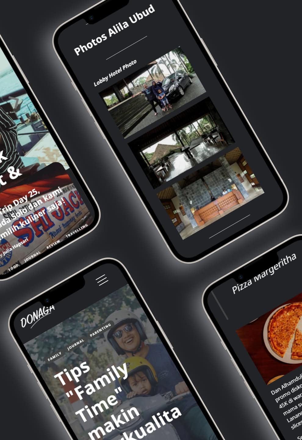
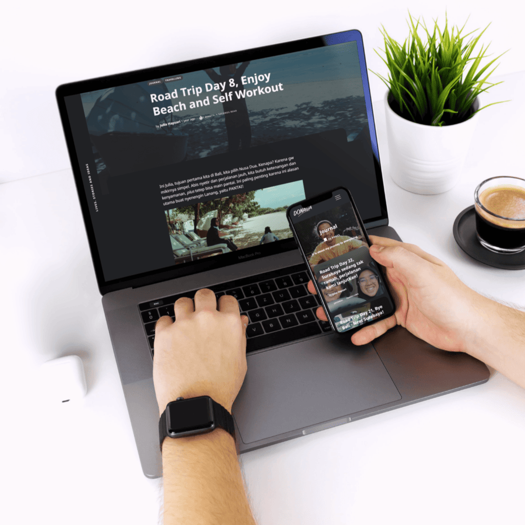
Rather than default white theme, dark theme with dark background is easy to the eye. So it gives benefit of less eye-strain, when it comes to blog post or article website, the dark theme is sometimes a good choice.
Results
